Materials and Design
How to Choose the Right Grout Color for Your Backsplash or Fireplace
Grout color can change the entire look of a backsplash or fireplace. This guide explains how matching grout, contrast grout, undertones, grout joint size, pattern visibility, and maintenance should influence the final decision.
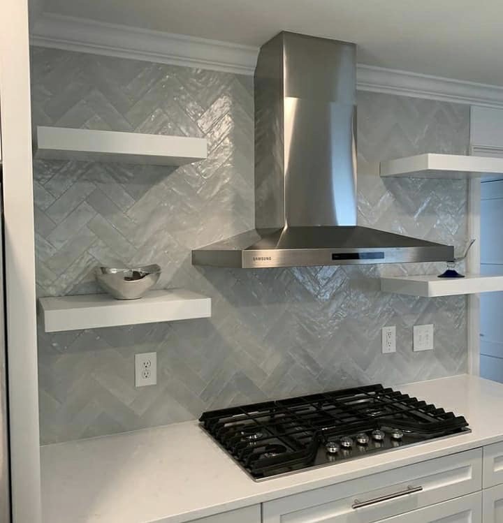
Grout color may seem like a small decision, but it can change the entire look of a backsplash or fireplace.
The same tile can look soft and quiet with one grout color, bold and graphic with another, or unfinished if the undertone is wrong. Grout can make a pattern disappear, make it stand out, warm up the design, cool it down, or draw attention to details the homeowner did not expect to notice.
For homeowners planning a backsplash or fireplace tile project in the Charlotte area, grout should not be treated as an afterthought. It is part of the design.
The right grout color depends on the tile, pattern, grout joint size, room style, lighting, maintenance expectations, and the level of contrast the homeowner wants to see every day.
Grout Is Part of the Finished Design
Tile usually gets most of the attention during the selection process, but grout is what visually connects each piece.
Grout affects:
- How visible the tile pattern appears
- Whether the installation feels calm or busy
- How warm or cool the finished surface looks
- How clean the tile edges appear
- How much maintenance the surface may require
- Whether small layout details become more noticeable
- How the backsplash or fireplace fits the rest of the room
A white subway tile with soft white grout feels very different from the same tile with dark gray grout. A marble herringbone backsplash with matching grout feels softer than the same tile with a strong contrast joint. A fireplace surround with warm gray grout may feel more natural than one with a cooler, sharper tone.
The tile does not change, but the finished impression does.
Start With the Look You Want
Before choosing grout, decide what role the grout should play.
Most grout decisions fall into three broad directions:
- Matching grout
- Slight contrast grout
- High contrast grout
Each creates a different effect.
Matching grout creates a softer, more seamless look. Slight contrast grout defines the tile without making the pattern too bold. High contrast grout makes the pattern stand out and can create a more graphic or traditional look.
None of these options is automatically better. The right choice depends on the tile, the kitchen or fireplace design, and the homeowner's preference.
Matching Grout: Soft, Clean, and Subtle
Matching grout is usually chosen when the homeowner wants the tile to feel calm and cohesive.
This means the grout color is close to the body color of the tile. It does not need to be an exact match, but it should feel related.
Matching grout works well for:
- Marble-look porcelain
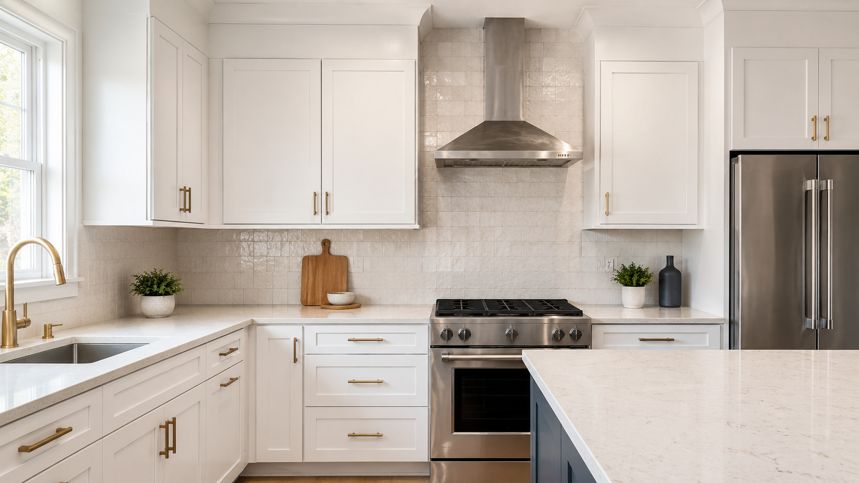
- Zellige-style tile
- Handmade-look tile
- Warm white tile
- Large-format tile
- Subtle subway tile
- Fireplace tile with natural movement
- Kitchens where the countertop already has strong veining or pattern
Matching grout can help the tile feel more refined and less busy. It is often a strong choice when the homeowner wants the backsplash or fireplace to feel high-end without becoming too graphic.
This approach can also help soften slight variation in handmade or textured tile. Instead of outlining every tile, the grout allows the surface movement to feel more natural.
Slight Contrast Grout: Definition Without Harshness
Slight contrast grout is often the safest middle ground.
It gives the tile enough definition to show the layout, but it does not overpower the design.
For example, a warm white tile may pair well with a soft beige, warm gray, or light taupe grout. A marble-look tile may work with a soft gray that picks up the veining. A fireplace tile may benefit from a grout color that relates to the stone, mantel, hearth, flooring, or surrounding wall color.
Slight contrast grout works well for:
- Subway tile
- Herringbone
- Vertical stack tile
- Marble-look tile
- Handmade-look tile
- Fireplace surrounds
- Transitional kitchens
- Warm neutral interiors
This is often the best choice when the homeowner wants the pattern to be visible, but still polished.
The goal is definition, not distraction.
High Contrast Grout: Bold, Graphic, and Pattern-Focused
High contrast grout makes the tile pattern a major part of the design.
This could mean dark grout with white tile, light grout with dark tile, or any pairing where the grout clearly outlines each piece.
High contrast grout can work well for:
- Classic subway tile
- Black-and-white kitchens
- Industrial-inspired designs
- Vintage-inspired kitchens
- Certain mudroom or laundry tile designs
- Graphic accent walls
- Specific fireplace feature designs
The benefit is visual impact. The risk is that every tile, every cut, and every grout line becomes more noticeable.
High contrast grout can make even a simple tile feel intentional, but it can also make the surface feel busy. It should be used carefully in kitchens with heavily veined countertops, detailed cabinets, strong hardware, or a lot of visual movement.
For premium homes, high contrast grout usually works best when the rest of the design is controlled.
Warm vs. Cool Undertones Matter
One of the most common grout mistakes is choosing a color that is technically close, but visually wrong.
This usually happens because of undertones.
A grout color may look gray on the sample card, but it may read blue, green, beige, yellow, or pink once installed next to the tile, countertop, cabinets, and lighting.
Warm grout colors often include:
- Cream
- Beige
- Taupe
- Warm gray
- Sand
- Almond
- Soft greige
Cool grout colors often include:
- Bright white
- Cool gray
- Silver gray
- Charcoal
- Blue-gray
- Concrete gray
Warm tile usually pairs better with warm grout. Cool tile usually pairs better with cool grout. Mixing the two can work, but it needs to be intentional.
In many Charlotte-area homes with warm white cabinets, wood tones, brass hardware, creamy countertops, or natural stone finishes, a stark cool grout can feel harsher than expected. In a modern kitchen with crisp white cabinets, black hardware, and cooler stone surfaces, a warm beige grout may feel out of place.
Grout should be checked against the whole room, not only against the tile.
Lighting Changes How Grout Looks
Lighting can make grout look different from one kitchen to another.
Natural light, under-cabinet lighting, warm bulbs, cool bulbs, shadows, and surrounding finishes all affect how grout reads.
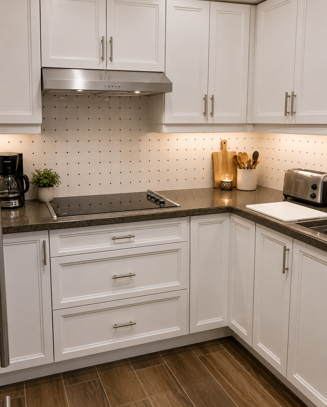
A grout color that looks soft in a showroom may look darker under cabinets. A bright white grout may look sharper under LED lighting. A warm gray may look beige in one kitchen and neutral in another.
This is especially important for backsplashes because they often sit under upper cabinets where lighting is uneven.
Fireplaces are different. A fireplace wall may be seen in natural daylight, evening lighting, and shadow. If the tile has texture, the grout may also catch light differently across the surface.
Homeowners should review grout color in the actual space whenever possible.
Grout Joint Size Changes the Final Look
The size of the grout joint affects how much grout is visible.
A narrow grout joint creates a cleaner and more seamless surface. A wider grout joint makes the grid or pattern more visible.
Grout joint size may be influenced by:
- Tile size
- Tile shape
- Tile edge type
- Handmade variation
- Material type
- Layout pattern
- Manufacturer recommendations
- Surface conditions
- Desired finished look
Rectified tile may allow a tighter joint when appropriate. Handmade, zellige-style, or irregular tile often needs more flexibility because the tile pieces vary in size or shape.
This is why grout color and grout joint size should be considered together. A darker grout in a wider joint will be much more visible than a similar grout in a narrow joint.
Pattern Visibility Depends on Grout Color
Grout can either quiet the pattern or emphasize it.
This matters most for layouts such as:
- Subway tile
- Herringbone
- Chevron
- Basket weave
- Vertical stack
- Mosaic tile
- Picture-frame borders
- Range-wall features
- Fireplace feature walls
If the homeowner wants the pattern to be the main design feature, more contrast may be appropriate.
If the homeowner wants texture without visual busyness, a closer grout match usually works better.
For example, a herringbone backsplash can feel elegant with a soft matching grout. The same herringbone tile with high contrast grout can feel more graphic and active. Neither is wrong, but the result is completely different.
Grout should match the design goal. For layout context, see backsplash layouts explained.
Grout Color for White Tile
White tile is one of the most common places where grout decisions matter.
White tile does not automatically require white grout.
Common options include:
- White grout for a clean, seamless look
- Warm white grout for a softer finish
- Light gray grout for subtle definition
- Warm gray or greige grout for a more forgiving neutral
- Dark grout for a bold, graphic look
Bright white grout with white tile can feel crisp, but it may require more cleaning attention in certain areas. Light gray or warm gray can be more forgiving while still keeping the backsplash clean.
For a high-end kitchen, the best white tile grout usually depends on the countertop, cabinet color, tile finish, and how much pattern definition the homeowner wants.
Grout Color for Marble and Marble-Look Tile
Marble and marble-look tile usually need a grout color that relates to the veining.
For many marble-style tiles, soft white, light gray, warm gray, or subtle greige may work better than a sharp contrast.
The goal is usually to support the stone movement, not outline every tile too strongly.
This is especially true for:
- Marble herringbone backsplashes
- Marble mosaics
- Marble-look porcelain
- Fireplace surrounds
- Shower niches
- Range-wall features
A grout that is too dark can make marble tile look busier. A grout that is too bright can fight with softer stone tones. A grout that matches the general veining direction often feels more natural.
With real marble or natural stone, grout selection should also consider sealing, staining potential, and maintenance expectations. For material context, see best backsplash materials for a high-end kitchen.
Grout Color for Handmade and Zellige-Style Tile
Handmade and zellige-style tile usually has variation in color, surface, thickness, or edge shape.
That variation is part of the appeal.
For these tiles, grout should usually support the natural movement instead of making every irregular edge stand out. Soft white, warm white, beige, taupe, warm gray, or a tonal match often works well depending on the tile color.
High contrast grout can be risky with handmade tile because it may emphasize irregular edges more than intended.
That does not mean contrast grout can never work. It means the homeowner should understand that the grout will highlight the character of the tile, including its variation.
For many premium kitchens, a softer grout choice helps handmade tile feel refined instead of chaotic.
Grout Color for Fireplace Tile
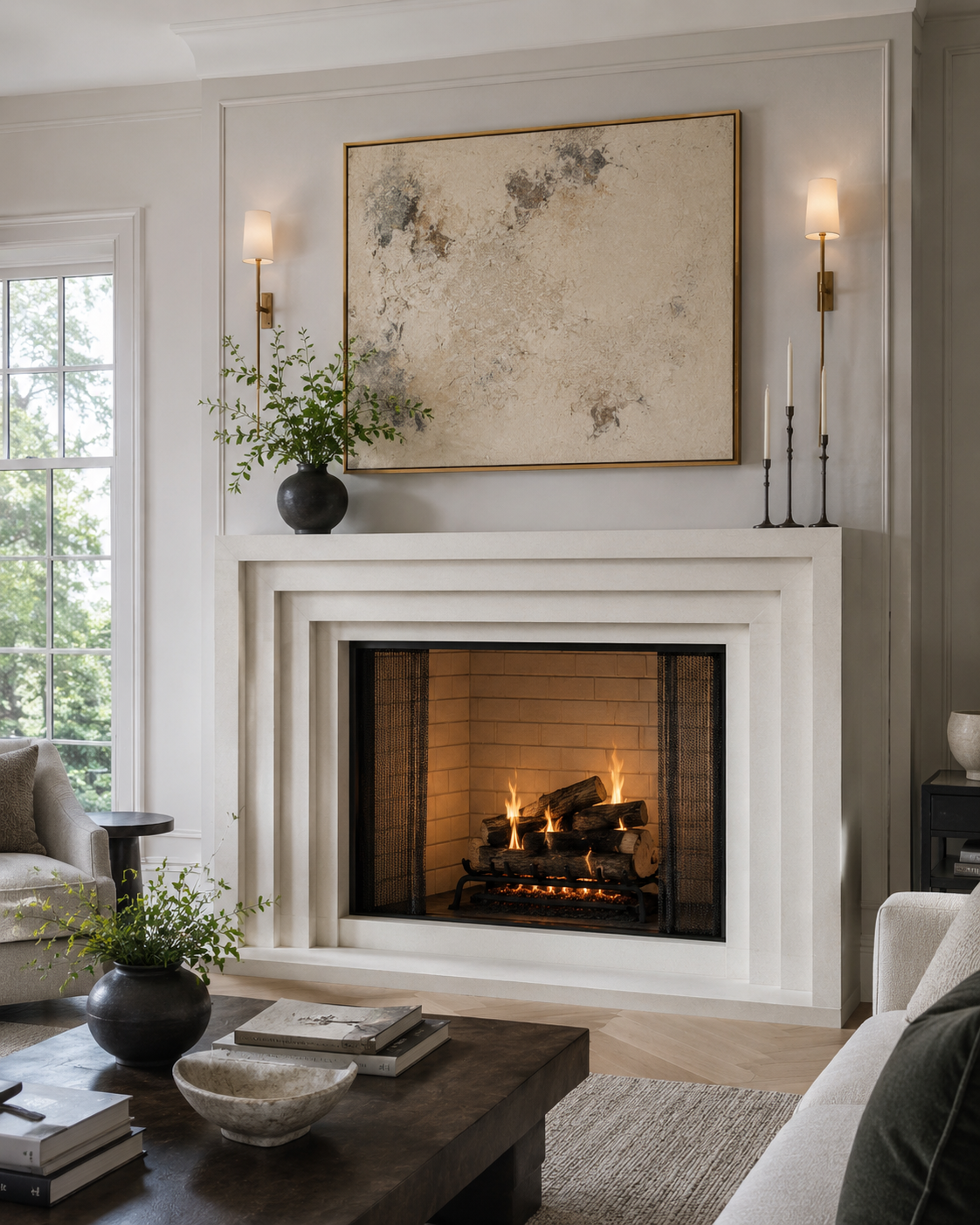
Fireplace tile is different from backsplash tile because it usually functions as a focal point in the room.
The grout color should work with more than the tile itself. It should also relate to:
- Wall color
- Mantel material
- Hearth material
- Flooring
- Built-ins
- Fireplace insert or firebox
- Surrounding stone, wood, or metal finishes
- Overall room style
A fireplace with large-format porcelain may look best with a grout that nearly disappears. A textured tile fireplace may benefit from a tonal grout that lets the surface movement show. A traditional fireplace surround may work with a slightly more defined grout line if the pattern is part of the design.
Because fireplaces are often viewed from farther away than backsplashes, grout contrast can read differently. A grout color that feels subtle up close may create more pattern visibility from across the room.
Maintenance Should Be Part of the Grout Decision
Grout color affects maintenance perception.
Light grout can look clean and seamless, but it may show stains, splatter, or discoloration more easily in certain areas. Dark grout can be more forgiving in some applications, but it may show haze, residue, mineral deposits, or uneven coloring depending on the material and conditions.
For kitchen backsplashes, the range area is especially important. Cooking oils, sauces, steam, and daily cleaning can affect how grout looks over time.
For fireplaces, maintenance depends on the fireplace type, surrounding materials, and how much the surface is exposed to soot, dust, or heat-related residue.
Homeowners should think about:
- How often the kitchen is used
- How close the tile is to the range
- Whether the tile surface is smooth or textured
- Whether the grout color is very light or very dark
- Whether the grout needs sealing
- What cleaning products are safe for the tile and grout
- Whether low-maintenance appearance is more important than strong contrast
The best grout color should look good and make sense for how the space is used.
Grout Should Coordinate With More Than the Tile
A grout color should be checked against the full finish palette.
That includes:
- Cabinets
- Countertops
- Hardware
- Wall color
- Flooring
- Lighting
- Faucet finish
- Range hood
- Fireplace surround
- Mantel
- Built-ins
- Adjacent rooms
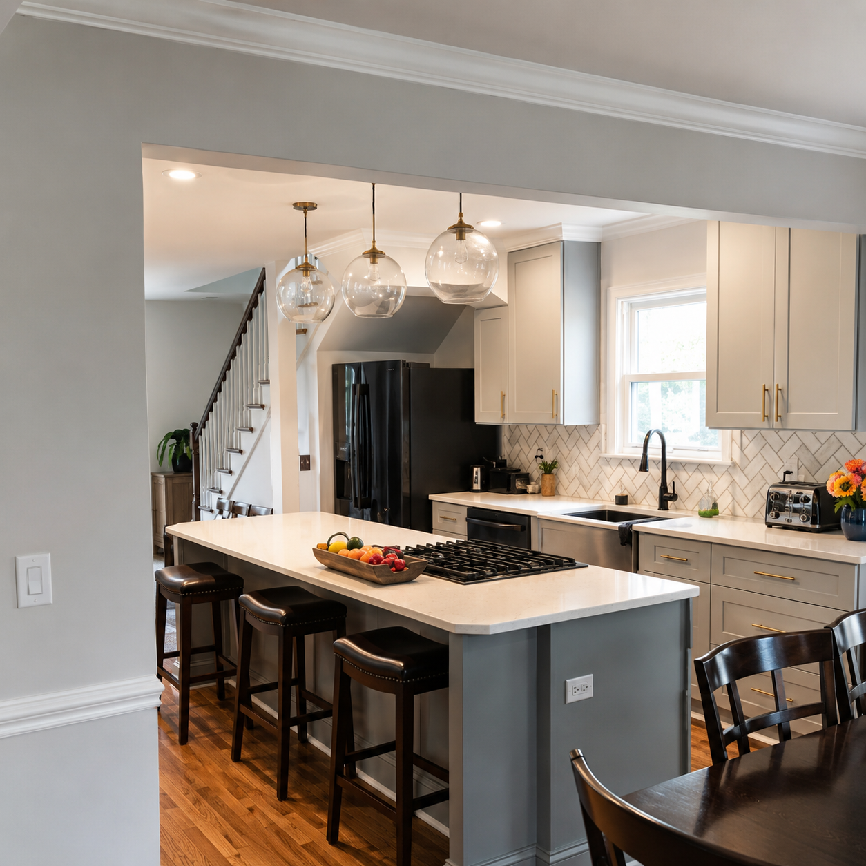
This is especially important in open-concept homes where the kitchen or fireplace can be seen from multiple angles.
A grout color that looks right on the tile sample may feel wrong once it is placed near warm wood flooring, cool quartz countertops, brass hardware, black fixtures, or creamy cabinets.
The right grout should feel like part of the room.
Common Grout Color Mistakes to Avoid
Many grout regrets happen because the decision is made too quickly.
Common mistakes include:
- Choosing grout from a sample card without checking the tile
- Ignoring warm and cool undertones
- Using high contrast grout without realizing how bold the pattern will look
- Choosing bright white grout only because the tile is white
- Using dark grout to hide maintenance without considering the style
- Forgetting that wider joints make grout more visible
- Not considering how grout will look around outlets and edges
- Choosing grout before finalizing the tile layout
- Ignoring the countertop and cabinet colors
- Treating grout as a technical decision instead of a design decision
Grout should not be the last-minute choice made after the tile is already on site. It should be part of the planning conversation.
How to Choose Grout Color Step by Step
A practical grout selection process can help homeowners avoid guesswork.
Start with these steps:
- Identify whether the tile should blend or stand out.
- Decide whether the finished look should feel soft, defined, or graphic.
- Review the tile undertone.
- Compare grout samples against the actual tile.
- Check the grout near the countertop, cabinets, hardware, and wall color.
- Consider the backsplash or fireplace lighting.
- Think about grout joint size.
- Review maintenance expectations.
- Confirm the grout choice before installation begins.
- Make sure the grout supports the overall design, not just the tile.
This process does not need to be complicated, but it should be intentional.
How CBC Helps Homeowners With Grout Decisions
CBC pays attention to the finish details that affect the final result.
Grout color is one of those details.
During a backsplash or fireplace tile project, CBC can help homeowners think through:
- Whether the grout should blend or contrast
- How the grout affects the tile pattern
- Whether warm or cool undertones make more sense
- How grout joint size affects visibility
- How the tile material affects grout selection
- Whether the pattern needs to be emphasized or softened
- How edge details and transitions will look
- What maintenance considerations should be understood before installation
The goal is not to overcomplicate the decision. The goal is to prevent a small finish choice from weakening the final design.
Explore backsplash installation services, fireplace tile installation, or view completed tile projects for grout and finish reference. For more on execution quality, see what makes a tile installation look high-end.
Final Takeaway
Grout is not a minor detail.
It can make a backsplash feel soft, classic, bold, modern, busy, clean, warm, cool, custom, or unfinished. The color, joint size, undertone, pattern visibility, and maintenance expectations all affect the final result.
For backsplashes and fireplaces, the right grout color should support the tile, fit the room, and match the level of finish the homeowner wants.
A well-chosen grout color does not call attention to itself for the wrong reasons. It helps the tile feel intentional.
Planning a Backsplash or Fireplace Tile Project?
CBC helps homeowners review tile material, layout direction, grout color, edge details, and installation scope before the project begins.
Request a tile estimate to plan a backsplash or fireplace tile project with a finished result that feels intentional.
FAQ
Should grout match the tile or contrast with it?
Matching grout creates a softer, more seamless look. Contrast grout makes the pattern more visible. The right choice depends on whether the homeowner wants the tile to feel calm and subtle or more graphic and defined.
What grout color is best for a white backsplash?
White tile can work with white, warm white, light gray, warm gray, greige, or dark grout depending on the desired look. White grout feels cleaner and softer, light gray adds subtle definition, and dark grout creates a stronger pattern.
Does grout color affect how expensive tile looks?
Yes. The wrong grout color can make premium tile look busy, harsh, or unfinished. A well-chosen grout color supports the tile, complements the room, and helps the installation feel more intentional.
Is dark grout easier to maintain than light grout?
Dark grout can be more forgiving in some situations, but it is not maintenance-free. It may still show haze, residue, mineral deposits, or uneven coloring. The best grout choice should consider both appearance and how the kitchen or fireplace will be used.
Should fireplace grout be different from backsplash grout?
It can be. Fireplace grout should be chosen based on the tile, wall color, mantel, hearth, flooring, and overall room design. Because fireplaces are often focal points, grout contrast and undertone can have a stronger visual effect from across the room.