Materials and Design
The Details That Make a Backsplash Look Expensive
An expensive-looking backsplash is usually the result of restraint, planning, and execution. This guide explains the details that make backsplash tile feel polished, including tile scale, layout, grout tone, range-wall treatment, outlet placement, edge finishing, cabinet alignment, and lighting.
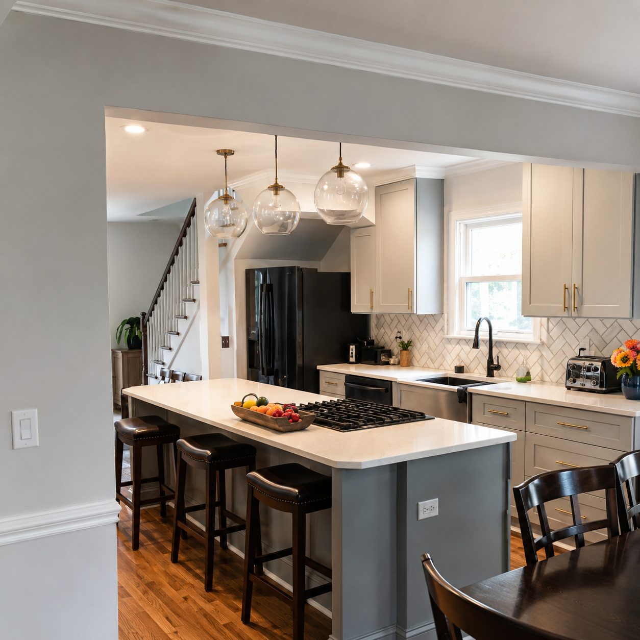
Expensive-looking tile work usually comes from restraint, planning, and execution.
That is especially true with kitchen backsplashes.
A backsplash does not need the most expensive tile in the showroom to look premium. It does not need a loud pattern, dramatic color, or complicated design. In many high-end kitchens, the backsplash looks elevated because the details are controlled: the layout is balanced, the grout tone is intentional, the outlets are handled cleanly, the edges are finished, and the tile fits the kitchen instead of competing with it.
For homeowners who want their kitchen to feel polished, finished, and intentional, the backsplash is one of the most important surfaces in the room.
It sits at eye level. It connects the cabinets and countertops. It catches under-cabinet lighting. It frames the range wall. It is seen every day.
The real difference is rarely one detail. It is the way all the details work together.
Expensive-Looking Backsplashes Usually Start With Restraint
A backsplash can look expensive without looking busy.
In fact, many backsplashes look more refined when the design is restrained. That means the tile supports the kitchen instead of trying to overpower it.
A restrained backsplash may use:
- A soft neutral tile
- Handmade-look ceramic
- Marble-look porcelain
- Large-format tile
- Subtle texture
- Tonal grout
- Clean vertical stack
- A simple range-wall detail
- Minimal edge trim
- Balanced proportions
Restraint does not mean boring. It means edited.
The backsplash should work with the cabinets, countertops, lighting, hardware, and flooring. If every surface is trying to be the focal point, the kitchen can feel visually crowded.
Premium kitchens often feel expensive because the details are quiet, not because the tile is loud.
Tile Scale Matters
Tile scale has a major effect on how expensive a backsplash looks.
Small tile can create texture and detail. Larger tile can create a cleaner, more seamless look. Subway tile can feel classic. Vertical tile can feel more current. Mosaic tile can feel custom when used well, but busy when overused.
The right scale depends on the kitchen.
A small backsplash area may support smaller tile, handmade-look tile, or a classic pattern. A large open wall may need larger tile, vertical proportion, or a full-height feature so the surface does not feel under-designed.
Tile scale affects:
- How busy the backsplash feels
- How many grout lines are visible
- Whether the pattern feels balanced
- How the tile lands around outlets
- How the backsplash relates to cabinet height
- Whether the range wall feels proportional
- How refined the finished surface appears
A tile that looks good on a sample board may feel too small, too large, too busy, or too plain once it is installed across the kitchen wall.
An expensive-looking backsplash starts with choosing the right scale for the room.
Layout Is Where the Design Becomes Real
A tile layout can make average tile look better or expensive tile look worse.
The layout determines where the pattern starts, where it stops, how cuts land, how grout lines align, and how the backsplash relates to the most visible areas of the kitchen.
Strong layout planning considers:
- Cabinet lines
- Countertop edges
- Range-wall centerlines
- Outlet locations
- Window openings
- Open wall edges
- Corners
- Tile size
- Pattern direction
- Cut balance
- Edge trim
A backsplash that looks expensive usually feels controlled. The pattern does not appear random. The cuts do not feel accidental. The range wall does not feel off-center. The backsplash does not stop in an awkward place.
The installer should think through the entire wall before tile is installed.
That planning is one of the biggest differences between a basic backsplash and a refined one. For more on pattern direction and layout options, see backsplash layouts explained.
Grout Tone Can Change the Entire Look
Grout is not just filler between tiles.
It is a design decision.
The grout tone affects how visible the tile pattern appears, how warm or cool the backsplash feels, and whether the finished result looks soft, graphic, traditional, modern, or busy.
In premium kitchens, grout is often chosen with restraint.
Common grout directions include:
- Matching grout for a seamless look
- Slight contrast grout for subtle definition
- Warm neutral grout for softer tile
- Light gray grout for marble-look tile
- Cream or ivory grout for warm white tile
- Dark grout only when the graphic effect is intentional
High contrast grout can work, but it is less forgiving. It makes every line, cut, outlet, and imperfection more visible.
For many expensive-looking backsplashes, tonal grout is the better choice because it creates polish without visual noise.
The grout should be selected with the tile, countertop, cabinets, and lighting. It should not be an afterthought. Learn more in our guide on how to choose the right grout color.
The Range Wall Should Feel Intentional
The range wall is often the visual center of the backsplash.
It may include a cooktop, range, hood, microwave, pot filler, shelf, or full-height tile area. Because this area naturally draws the eye, it needs planning.
A range wall can feel more expensive when:
- The tile is centered properly
- The pattern lands cleanly
- The backsplash relates to the hood
- The tile height feels proportional
- The grout lines feel balanced
- The outlet locations are handled cleanly
- The material has enough scale
- A focal detail is used with restraint
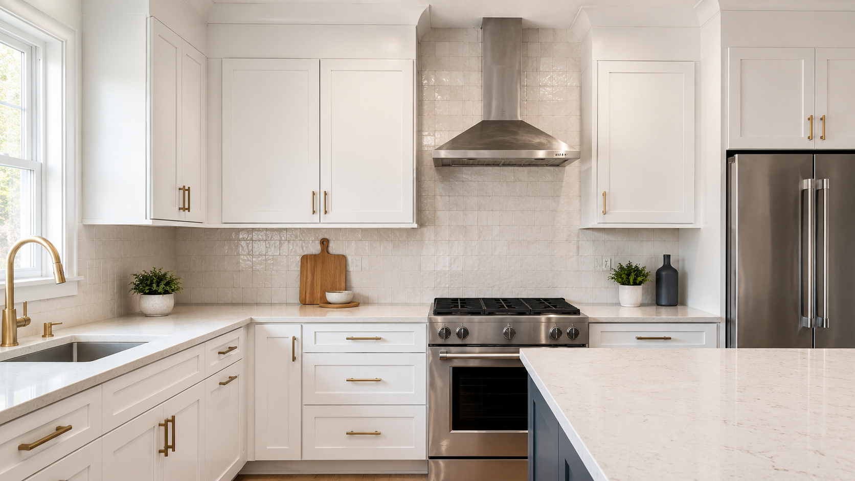
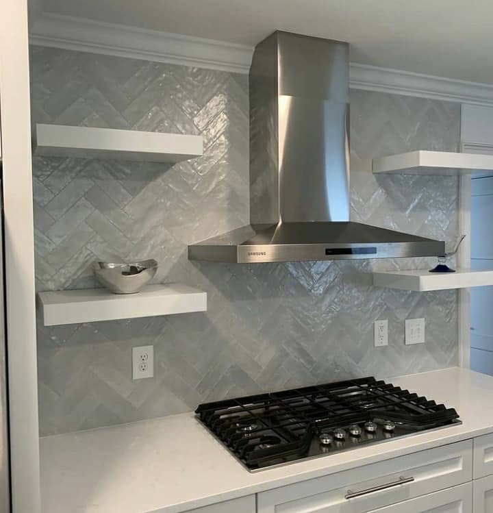
Not every kitchen needs a dramatic range-wall feature. Sometimes the most expensive-looking option is continuing the same tile cleanly behind the range. In other kitchens, a full-height range wall, herringbone feature, large-format tile, or framed detail can make the space feel more custom.
The key is intention.
The range wall should not look like leftover tile was placed behind the stove. It should look like the project was planned around the kitchen's most visible surface.
Outlet Placement and Cuts Matter More Than Homeowners Expect
Outlets and switches interrupt backsplash tile.
They are also one of the first places poor installation shows.
A backsplash can have beautiful tile, but rough outlet cuts or awkward tile pieces around cover plates can make the project look cheaper.
Outlet details affect:
- Tile cuts
- Pattern alignment
- Cover plate fit
- Visual interruption
- Grout-line consistency
- Range-wall balance
- Overall polish
Some outlet locations are fixed. Others may be reviewed as part of a broader kitchen plan when electrical work is involved. Even when outlet locations cannot change, the installer still needs to plan tile cuts carefully.
Clean outlet cuts are a detail many homeowners do not think about until the backsplash is finished.
In premium tile work, they are planned from the beginning.
Edge Finishing Is a Premium Detail
Tile has to end somewhere.
That edge is one of the clearest signs of whether a backsplash was planned well.
Finished edge options may include:
- Metal trim profiles
- Bullnose tile
- Finished tile edges
- Caulked transitions
- Natural stopping points
- Clean cabinet-line termination
- Tile wrapping a corner when appropriate
The right edge detail depends on the tile and the kitchen.
A modern porcelain backsplash may look best with a slim metal profile. A traditional kitchen may work better with bullnose if the tile line includes it. Some backsplashes do not need visible trim if the tile stops cleanly at a cabinet, corner, or other natural break.
What looks expensive is not the most complicated edge. It is the most resolved edge.
A backsplash should not leave exposed tile sides or awkward endings. See our guide on tile edge trim and finished edges for more detail.
Cabinet Alignment Affects the Finished Look
Cabinets create strong visual lines.
The backsplash needs to relate to those lines.
This matters at upper cabinet bottoms, cabinet ends, range openings, corner cabinets, floating shelves, and windows. If the tile layout ignores cabinet alignment, the finished backsplash can feel slightly off even if the tile itself is installed well.
Cabinet alignment affects:
- Tile starting points
- Tile stopping points
- Pattern centerlines
- Range-wall balance
- Edge trim placement
- Vertical grout lines
- Full-height backsplash decisions
Many kitchens are not perfectly square or level. Cabinets, walls, and countertops may have small variations. A professional backsplash installation accounts for those real conditions and makes the finished tile look as balanced as possible.
Expensive-looking tile work is not only about the tile. It is about how the tile relates to everything around it.
Lighting Can Reveal or Elevate the Backsplash
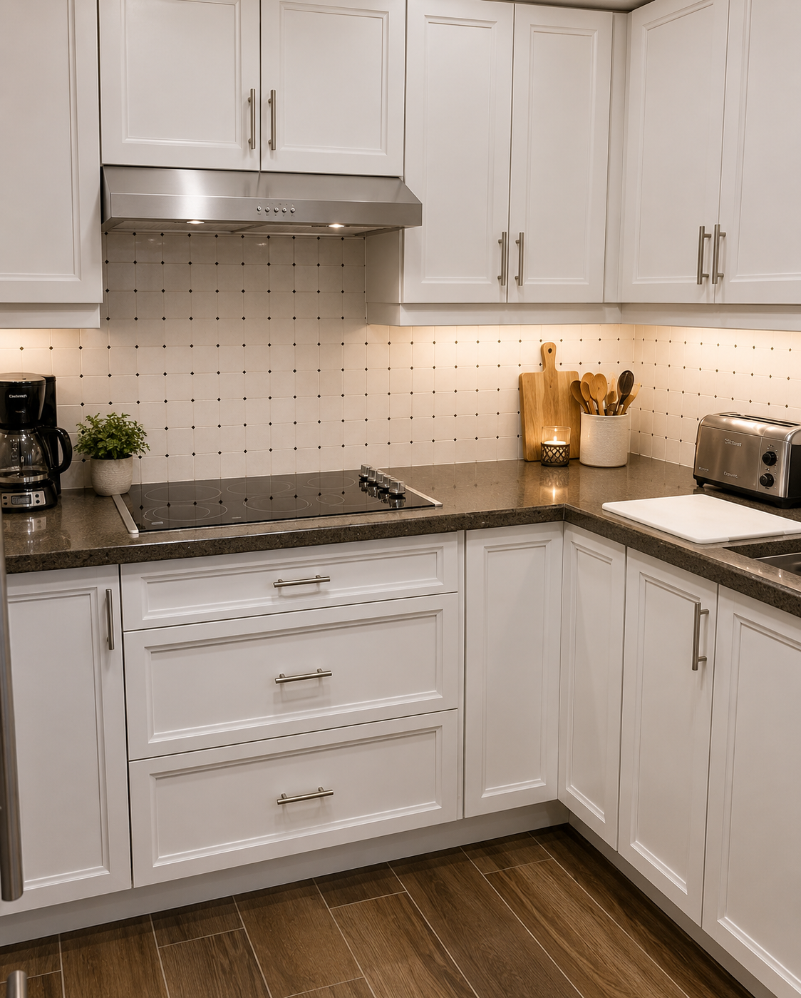
Under-cabinet lighting can make a backsplash look better or expose every flaw.
Glossy tile, handmade-look tile, glass tile, marble-look tile, and textured tile all react differently under light. Shadows can reveal uneven surfaces, lippage, grout inconsistencies, rough cuts, or wall imperfections.
Lighting affects:
- Tile texture
- Surface reflection
- Grout appearance
- Color temperature
- Shadow lines
- Edge visibility
- Range-wall impact
A backsplash should be reviewed in the actual kitchen lighting when possible.
A tile that looks warm in a showroom may look cool under LED lighting. A glossy tile may feel beautiful in natural light but busy under strong under-cabinet lighting. A textured tile may create shadow movement that looks premium in one kitchen and too active in another.
Lighting is part of the final design.
Material Quality Helps, but Execution Matters More
Better tile can help a backsplash look more expensive, but material alone does not guarantee a premium result.
A high-end tile can look poor if:
- The layout is off
- The grout color is wrong
- The cuts are rough
- The edges are unfinished
- The wall prep is weak
- The range wall feels unplanned
- The tile scale does not fit the kitchen
- The installer rushes the details
At the same time, a simple tile can look elevated when the layout, grout, edges, and finish are handled well.
This is why homeowners should not spend the full budget on tile and then treat installation as an afterthought.
The visible result comes from material and execution together. Review best backsplash materials for a high-end kitchen and what makes tile installation look high-end for related planning guidance.
The Countertop and Backsplash Need to Work Together
The backsplash should not fight the countertop.
If the countertop has dramatic veining or strong movement, the backsplash may need to be quieter. If the countertop is simple, the backsplash may have more room for texture, pattern, or visual detail.
A polished backsplash usually considers:
- Countertop color
- Countertop movement
- Warm or cool undertones
- Cabinet color
- Hardware finish
- Range wall
- Lighting
- Grout tone
The best kitchens feel cohesive.
The backsplash should make the countertop look better, not compete with it.
Expensive-Looking Does Not Always Mean Custom Pattern
Many homeowners assume an expensive backsplash needs herringbone, marble, mosaic, or a feature insert.
Sometimes that is true.
But often, the more expensive-looking choice is a simpler tile installed with cleaner planning.
A backsplash can feel premium with:
- Straight stack tile
- Vertical stack tile
- Soft subway tile
- Handmade-look ceramic
- Large-format porcelain
- Warm neutral grout
- Clean edge trim
- Full-height range area
- Subtle texture
The project should match the home.
A custom pattern that does not fit the kitchen can look less refined than a simple material used well.
Common Mistakes That Make a Backsplash Look Less Expensive
A backsplash may look less expensive when the details are not controlled.
Common issues include:
- Tile chosen only from a trend photo
- Too much contrast in the grout
- Tile scale that does not fit the wall
- Poorly centered range wall
- Awkward edge termination
- Exposed unfinished tile edges
- Rough outlet cuts
- Sliver cuts at visible ends
- Busy tile with busy countertops
- Lighting that exposes uneven installation
- Cabinet lines ignored during layout
- No plan for corners or transitions
These issues are often avoidable with better planning.
How CBC Plans Premium Backsplash Details
CBC approaches backsplash installation as a visible finish, not just a small tile job.
That means reviewing the details that affect how polished the kitchen feels.
CBC considers:
- Tile scale
- Material direction
- Layout
- Range-wall treatment
- Grout tone
- Outlet cuts
- Edge trim
- Cabinet alignment
- Wall condition
- Lighting
- Cleanup and finished presentation
The goal is not to make every backsplash elaborate. The goal is to make the backsplash feel intentional, balanced, and finished.
Expensive-looking tile work usually comes from restraint, planning, and execution. Explore backsplash installation services or view completed backsplash projects to see how CBC approaches these details.
Final Takeaway
A backsplash looks expensive when the details are controlled.
Tile scale matters. Layout matters. Grout tone matters. The range wall matters. Outlet cuts matter. Edge finishing matters. Cabinet alignment matters. Lighting matters.
The tile itself is only one part of the result.
A premium backsplash should feel like it belongs in the kitchen. It should look planned from one edge to the other. It should support the cabinets and countertops. It should look clean under lighting. It should feel polished without needing to be overly complicated.
The most refined tile work usually comes from restraint, planning, and execution.
Want a Backsplash That Looks Polished From Every Angle?
CBC helps homeowners plan backsplash projects with the right tile scale, layout, grout tone, edge detail, range-wall treatment, and finish quality so the kitchen feels intentional instead of generic.
Request an estimate to plan your backsplash project.
FAQ
What makes a backsplash look expensive?
An expensive-looking backsplash usually comes from the right tile scale, balanced layout, intentional grout tone, clean outlet cuts, finished edges, thoughtful range-wall treatment, and professional installation.
Does expensive backsplash tile always look better?
Not always. A simple tile can look high-end when installed well, while expensive tile can look poor if the layout, cuts, grout, and edge details are not planned correctly.
What grout color makes a backsplash look more high-end?
Tonal or soft contrast grout often creates a more refined look than harsh high-contrast grout. The best grout color depends on the tile, cabinets, countertops, and lighting.
Should the range wall have a special backsplash design?
Sometimes. A range-wall feature can look custom when the wall is centered, proportional, and planned carefully. In other kitchens, continuing the same tile cleanly behind the range looks more refined.
Why do tile edges matter on a backsplash?
Edges are where the tile ends, and unfinished edges can make the whole backsplash look incomplete. Clean trim, bullnose, finished edges, or natural stopping points help the project look polished.